Figma Design
Figma design preview

In collaboration with Telus World of Science and Exlir Simulations, we built a mobile AR app for science centre visitors that supports real-time navigation, interactive exhibit engagement, and gamified exploration with built-in accessibility features.
I contributed to research, user flow, wireframing, interaction design and testing. My role also focused on the technical aspect of the project, like 3D modelling and AR prototyping, to help build an engaging and accessible user experience for real-world visitor needs.
Visiting the science center is meant to be an immersive and exploratory experience, especially for families, children, and guests of all abilities. However, with so many exhibits, diverse visitor needs, and a dynamic physical environment, creating a cohesive, accessible journey across the space is an ongoing challenge. As a result, many visitors end up disoriented or frustrated, missing out on key learning moments and diminishing overall satisfaction.
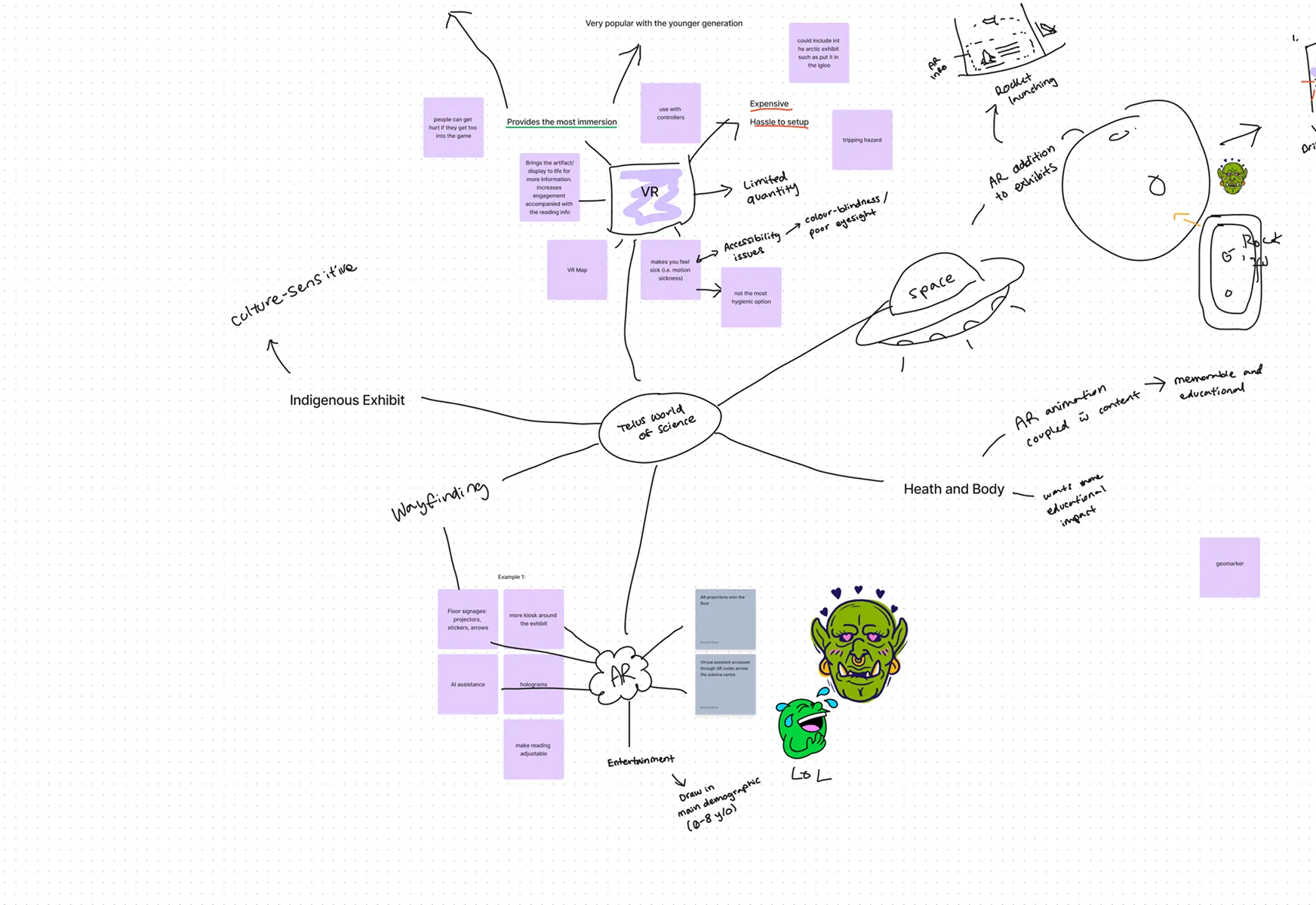
Limited Accessibility Across Navigation and Exhibits
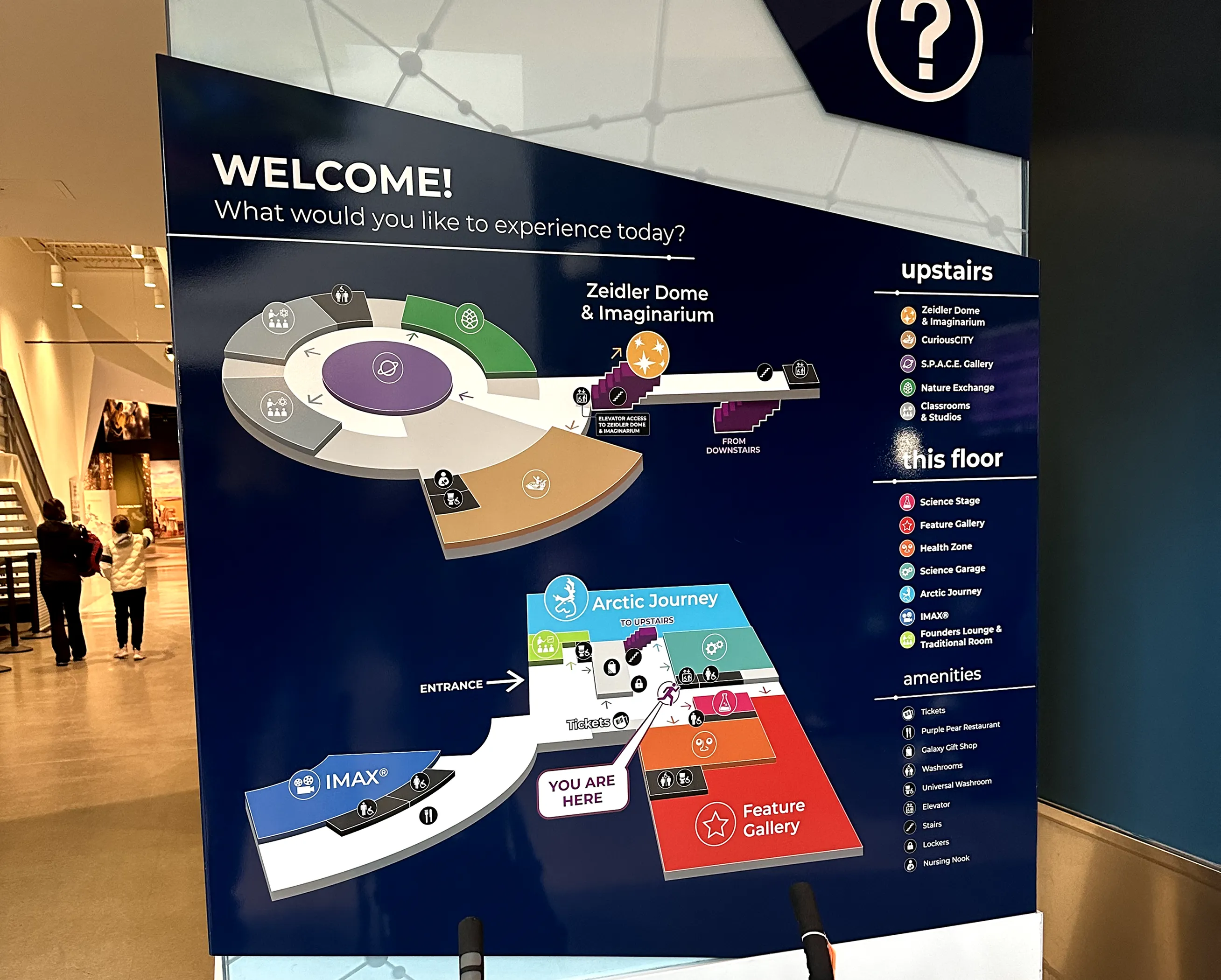
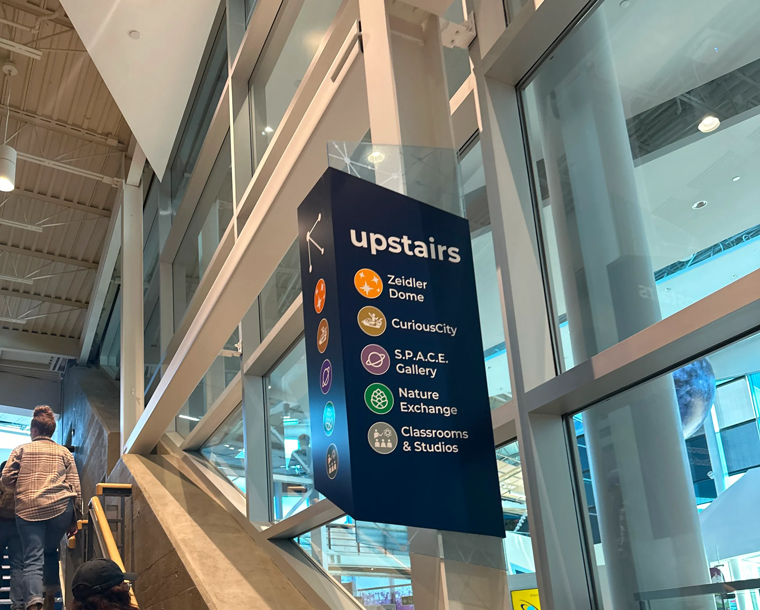
Guests frequently get lost due to missing signs and unclear elevator directions. Inconsistent wayfinding forces reliance on staff and interrupts the visit flow, especially during busy hours.
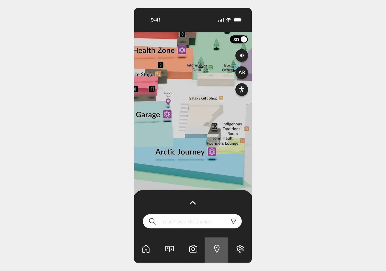
Confusing and Ineffective Map System
Existing maps lack clarity and adaptability, making it hard for guests to orient themselves or locate exhibits. Without real-time guidance or accessible formats, visitors often get lost or miss areas entirely.
Barriers to Hands-On Learning
Younger visitors struggle with text-heavy content and may also cause concern to fragile displays. Limited interactive opportunities restrict their ability to explore concepts through play and experimentation.
Low Engagement with Exhibits
Static presentations and minimal use of new or interesting technology lead to reduced interest, especially among repeat visitors. The lack of dynamic, personalized interaction diminishes overall engagement and learning retention.
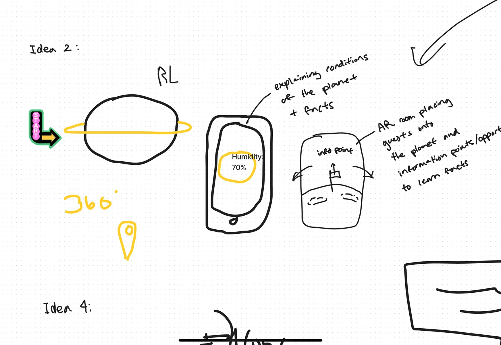
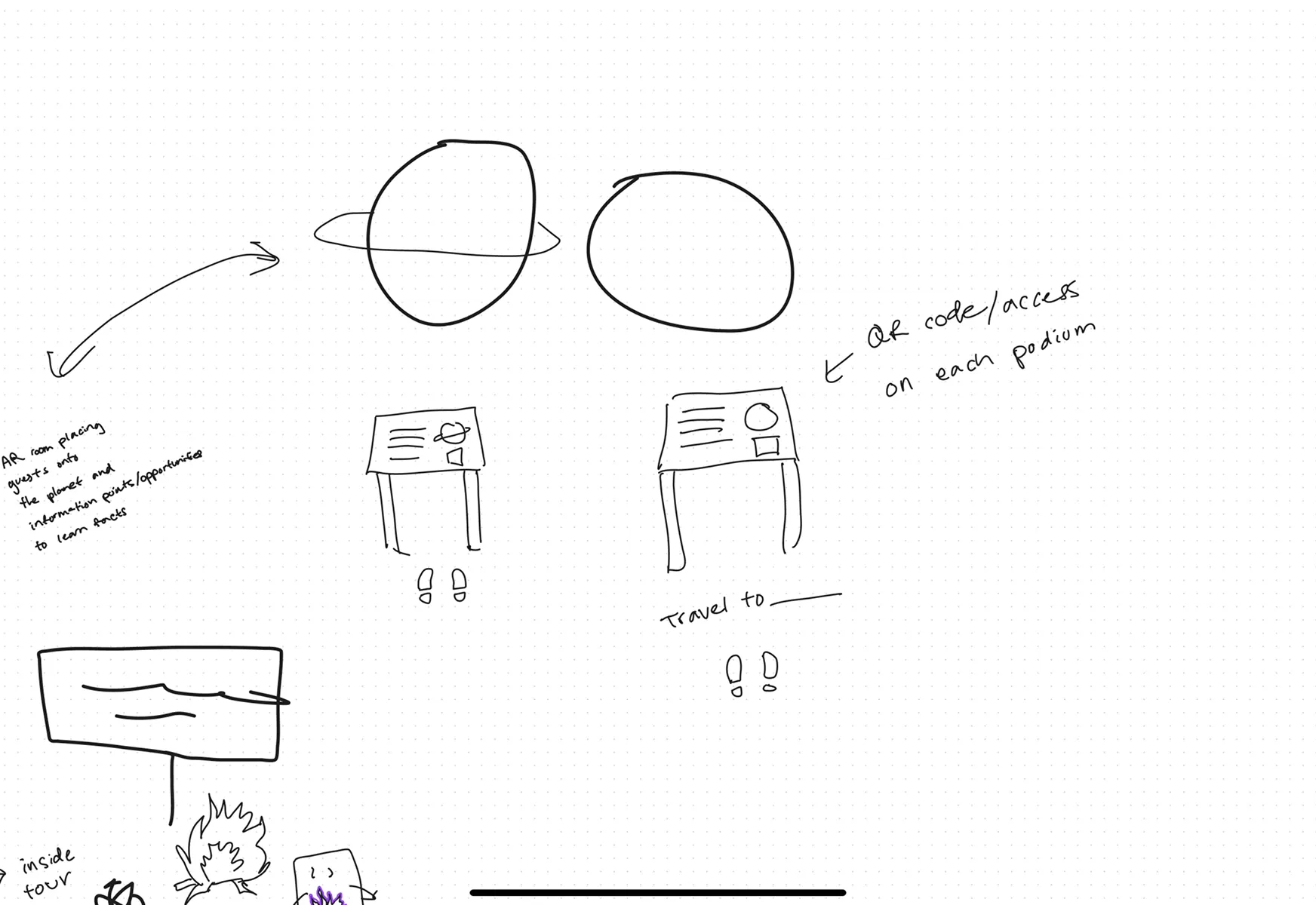
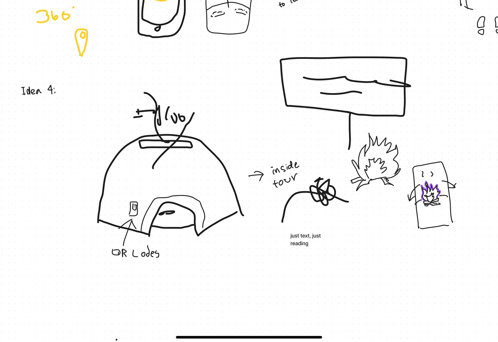
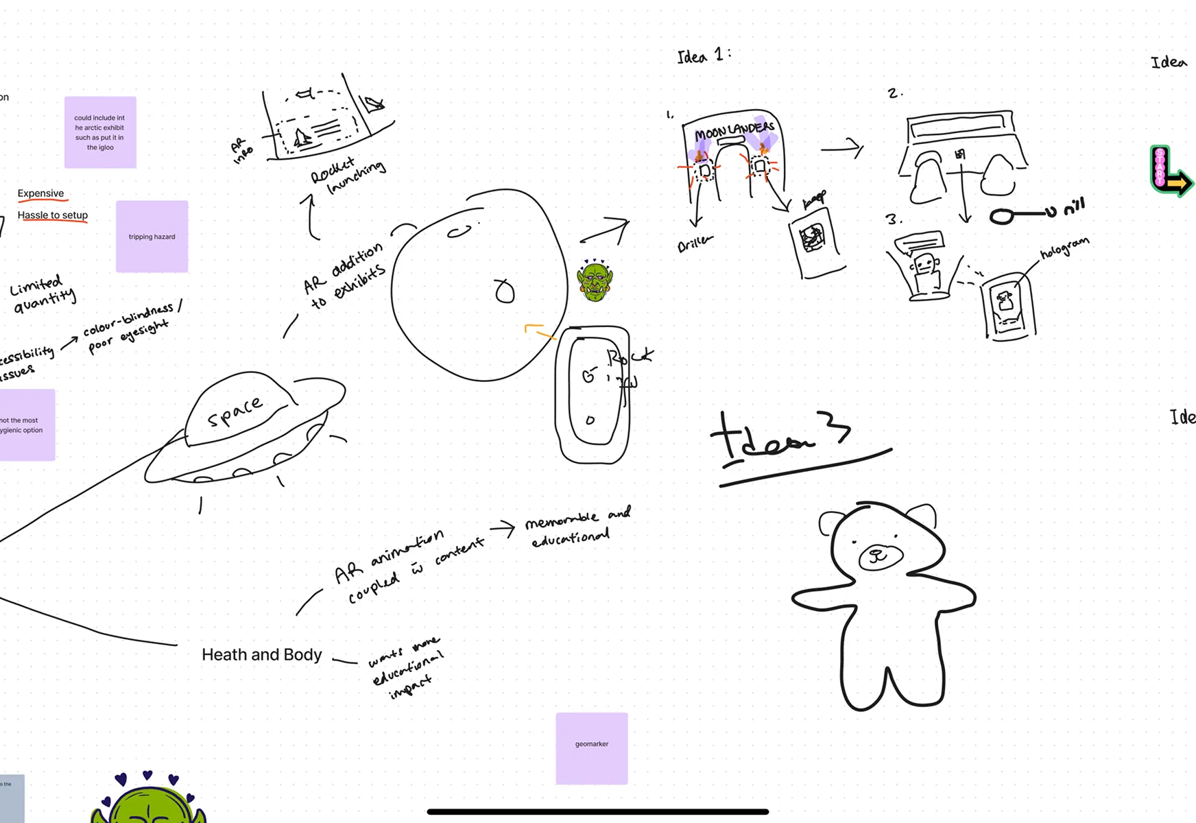
To address the identified challenges, we designed a mobile app that utilizes AR technology to enhance navigation and exploration at the science centre. Our solution integrates:
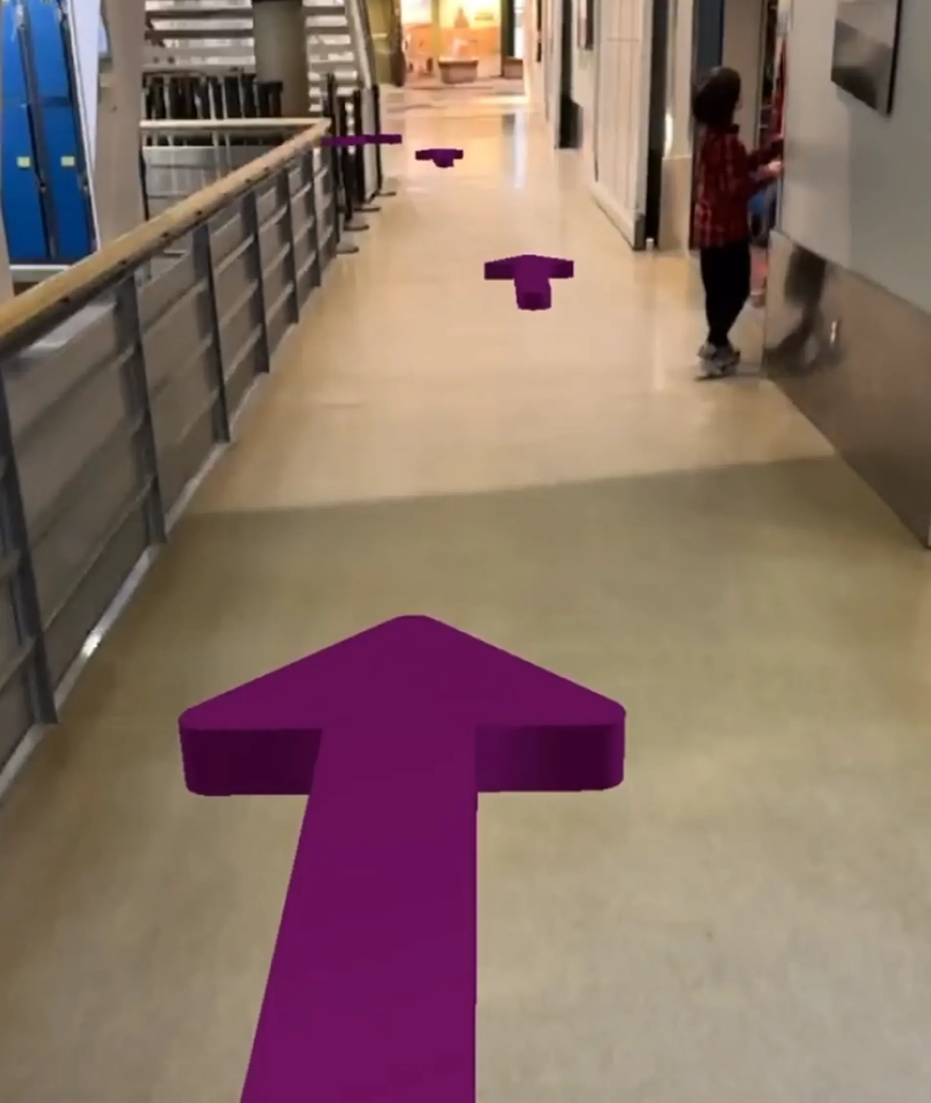
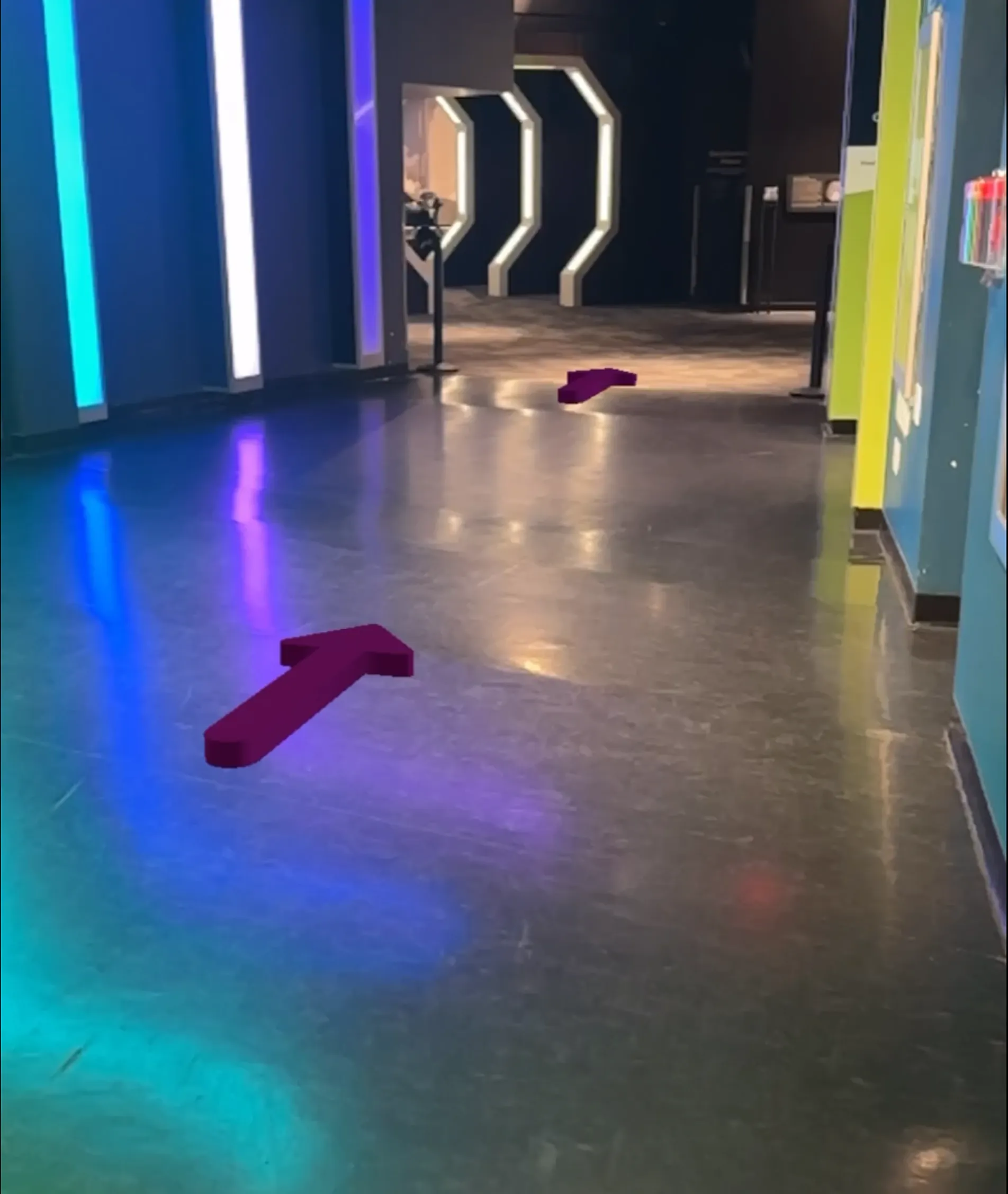
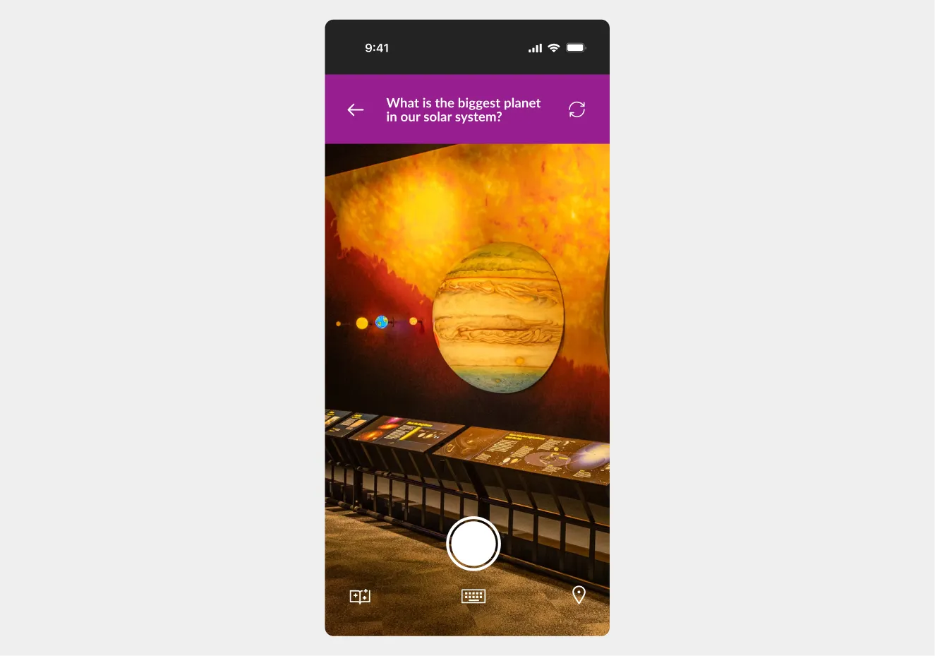
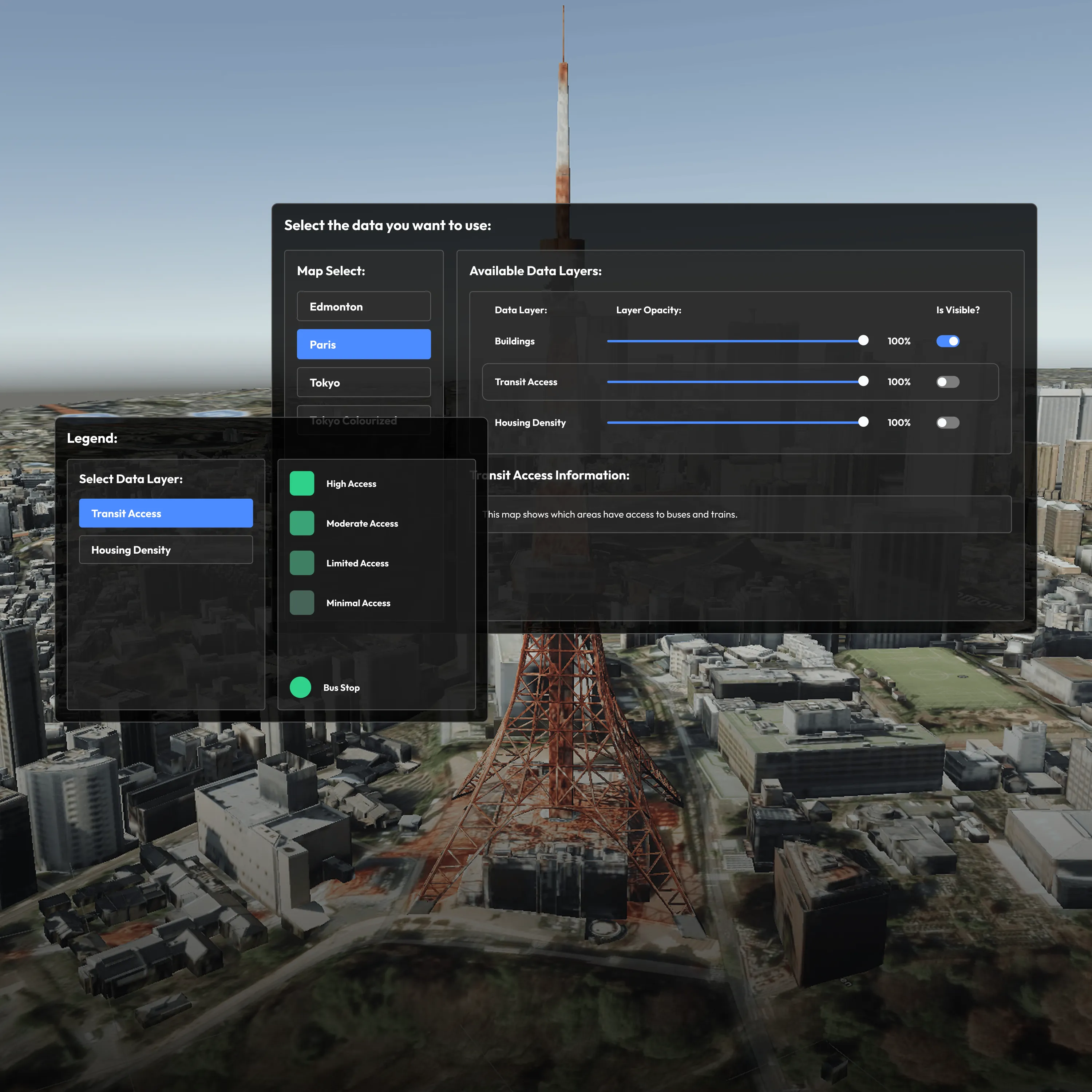
AR-Assisted, Real-Time Navigation
Guests can interact with the built-in map of their exhibit of choice and receive guidance through AR arrows, making it easier to locate exhibits, restrooms, and other key areas without confusion.
Gamified Exploration with a Digital Stamp Book
The app includes an interactive stamp system that encourages deeper engagement. Visitors collect stamps by interacting with exhibits, giving their visit a sense of progress, reward, and discovery.
Built-In Accessibility for All Users
With high-contrast visuals, audio narration, and simplified language, the app is designed to support a wide range of visitors, including children, seniors, and those with visual or sensory impairments.
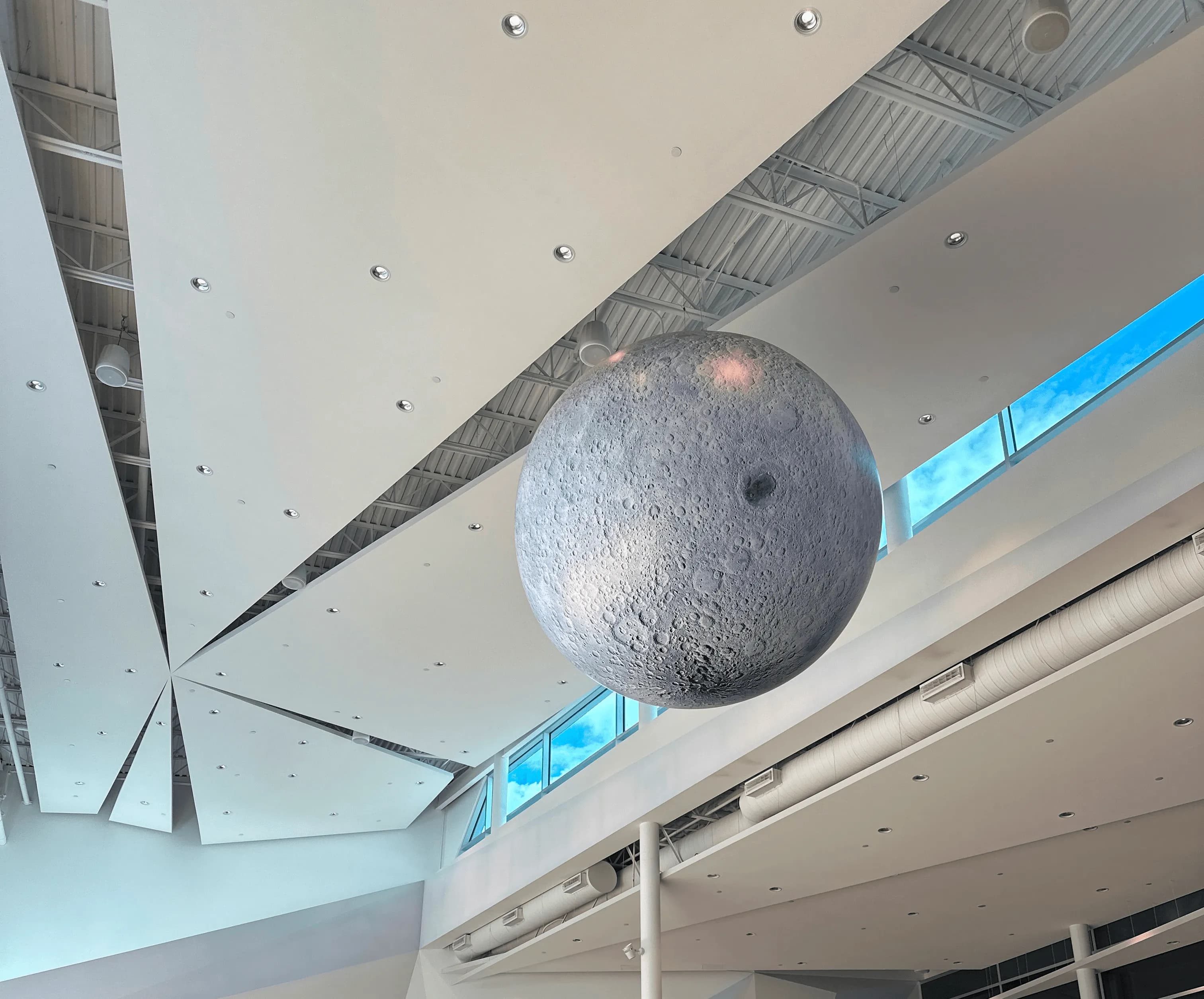
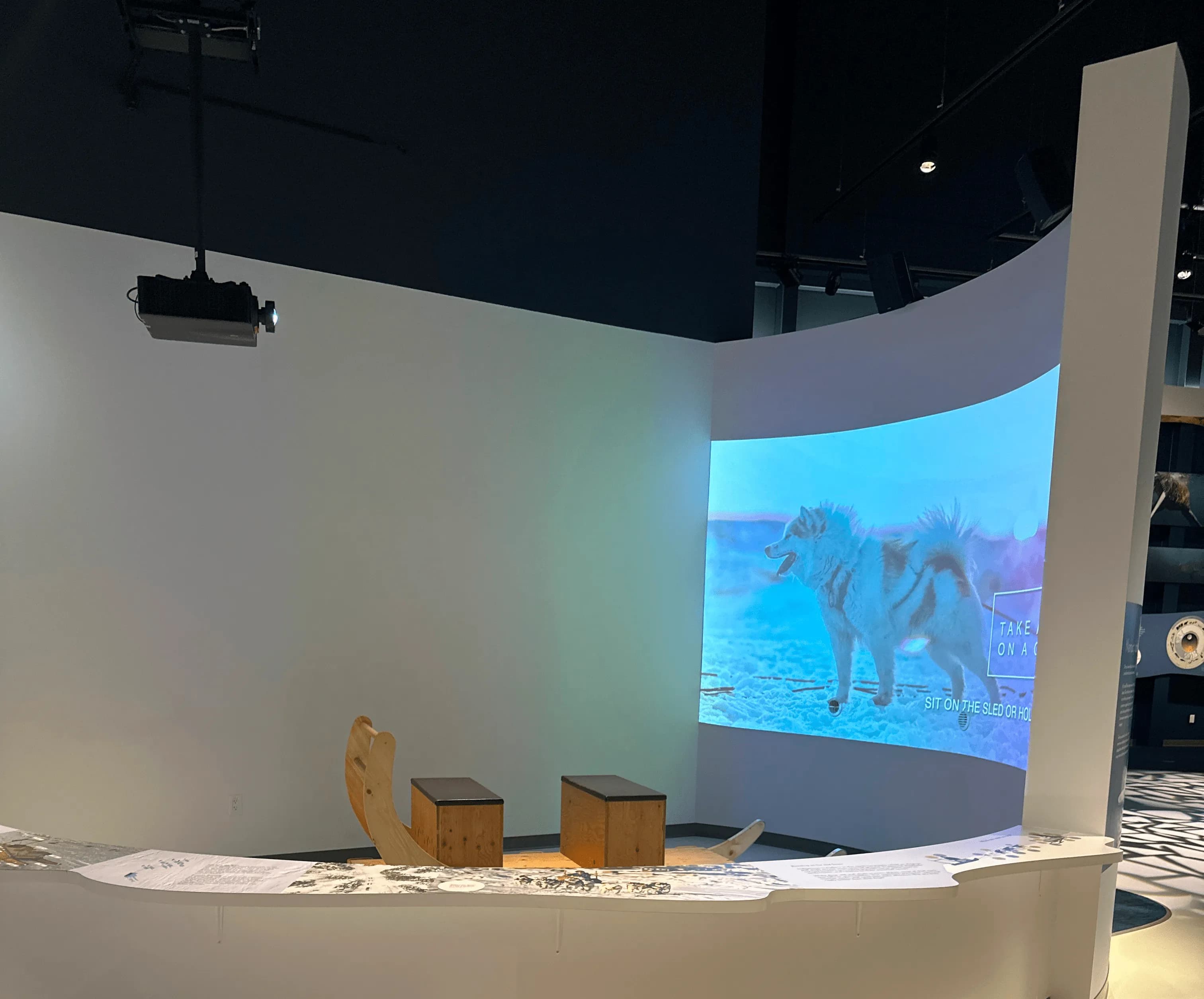
We visited the science centre for contextual research to understand visitor challenges and opportunities for AR and VR at Telus World of Science Edmonton. We received a tour and learned about key pain points and gaps in existing wayfinding and engagement tools. We constructed a user statement and a persona to help us work towards a solution.
"“As a visitor with a strong interest towards science, I want intuitive navigation and engaging interactive elements so I can focus on discovery without getting lost or bored.”"

"I like to create things that will amaze my classmates so that I can share my curiosity about science in a way that feels fun for everyone."
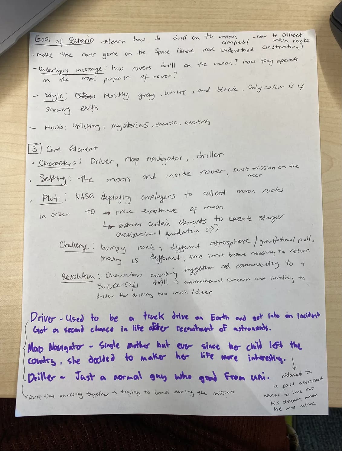
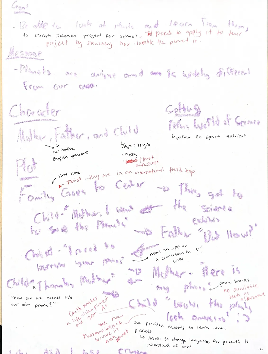
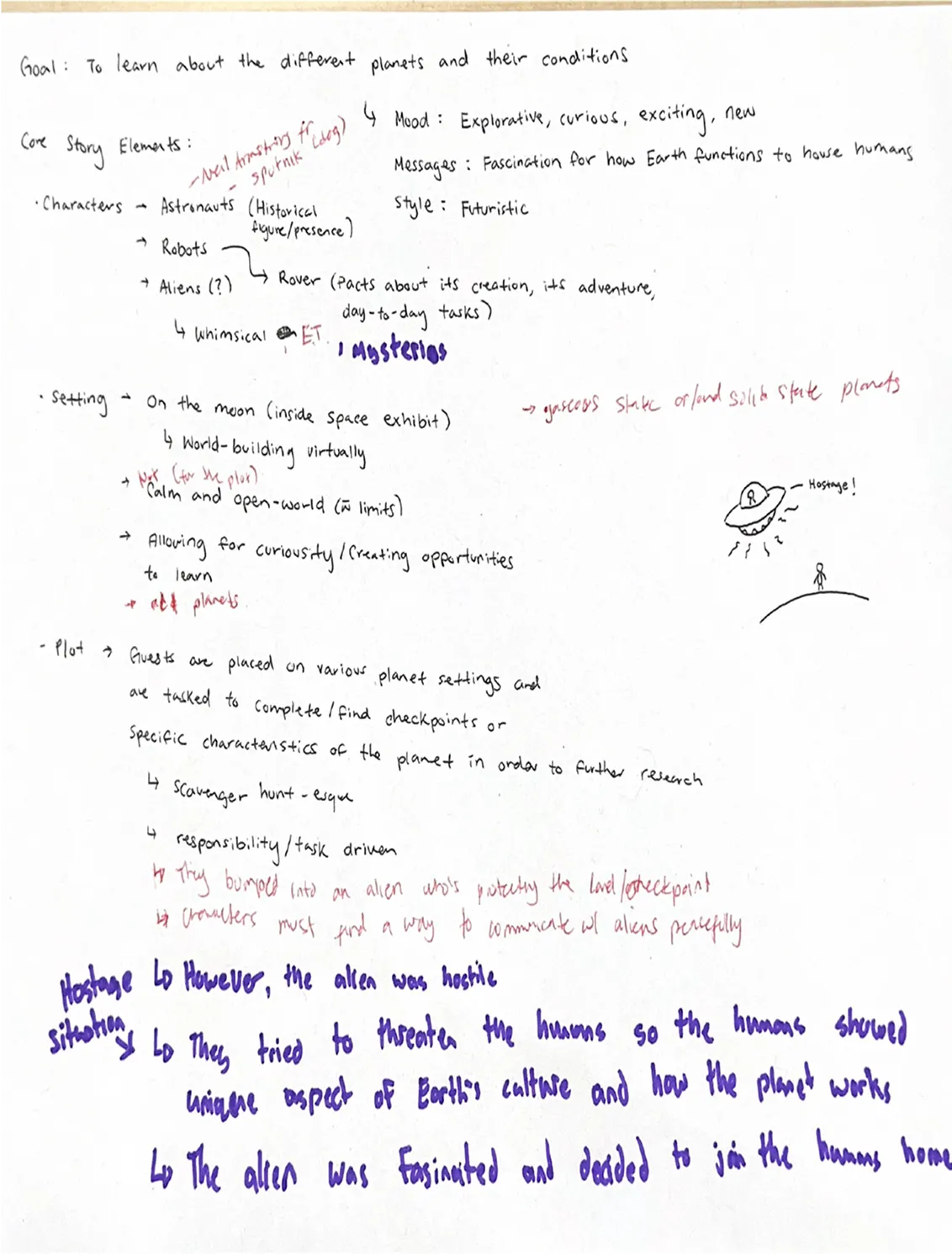
During this phase, I collaborated with my team to reimagine the visitor experience at the Telus World of Science, using user research to guide our design decisions. I contributed across all areas of the project while also taking the lead on AR prototyping and 3D modelling:
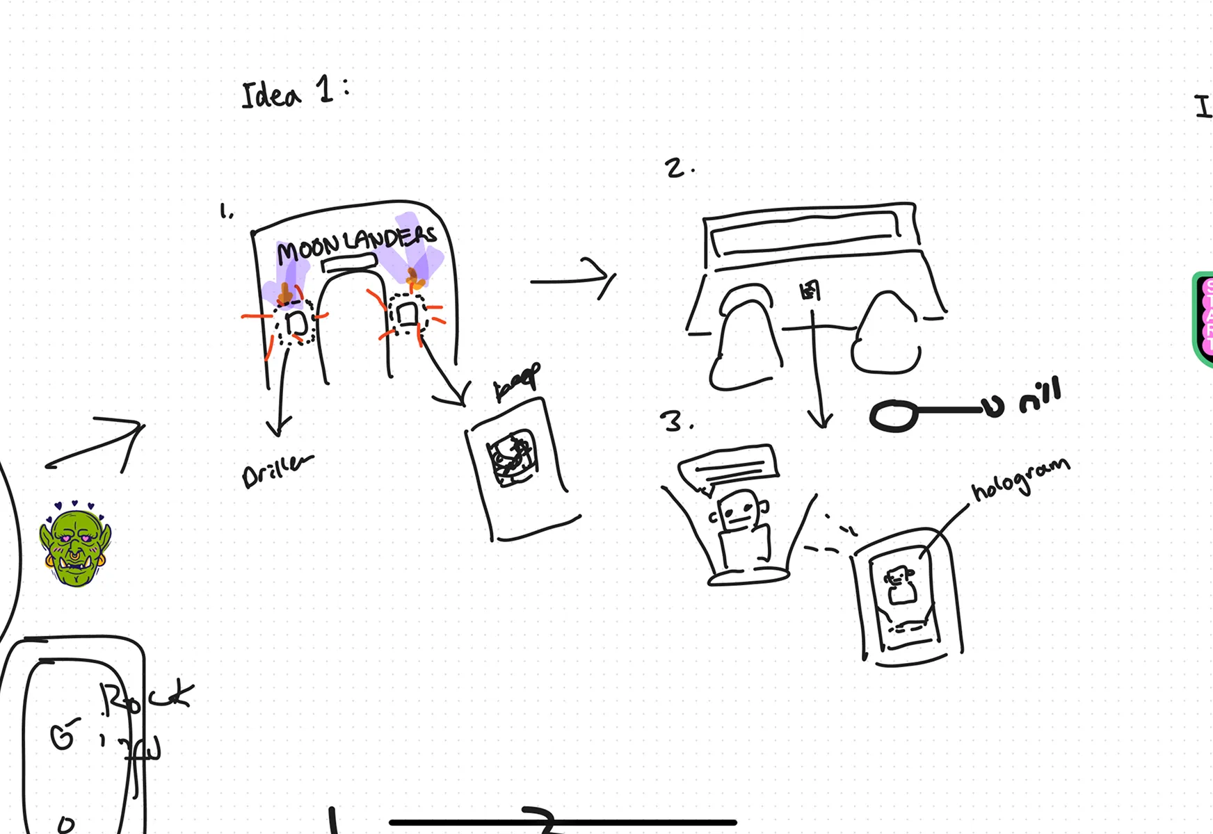
Developed and Prioritized Ideas Through Collaborative Workshops
We explored multiple concepts through mind mapping, brainwriting, and a prioritization matrix. We identified the most impactful features to address navigation and engagement challenges.
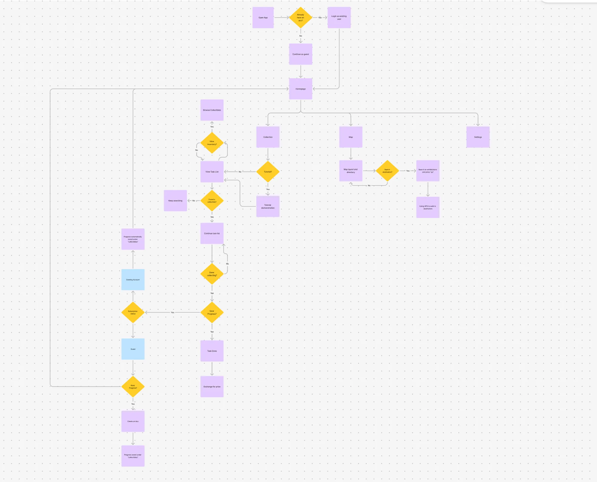
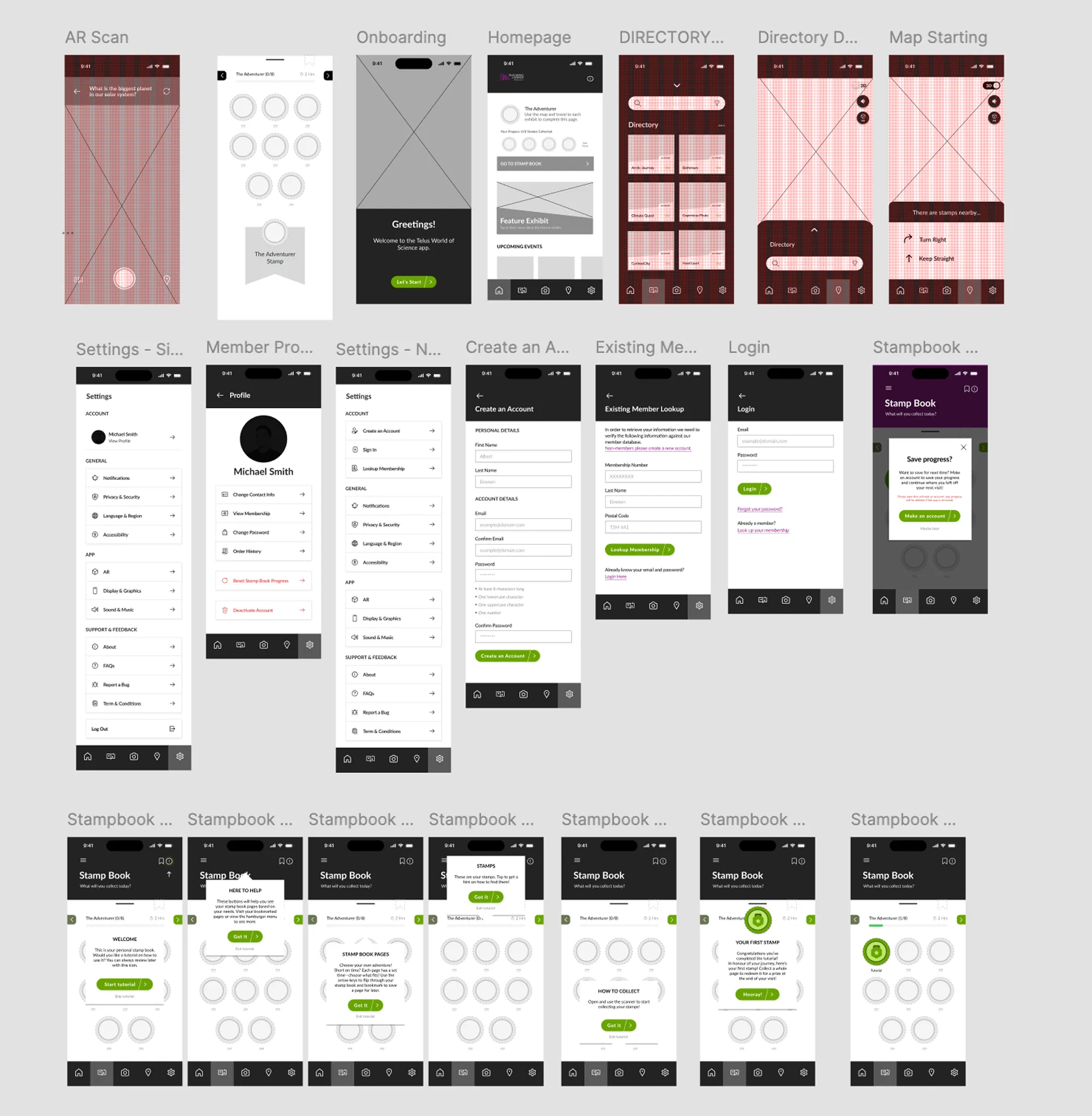
Mapped User Flows and Built Wireframes
We created detailed task flows to visualize how users would interact with the app and translated these into wireframes that balanced simplicity with functionality.
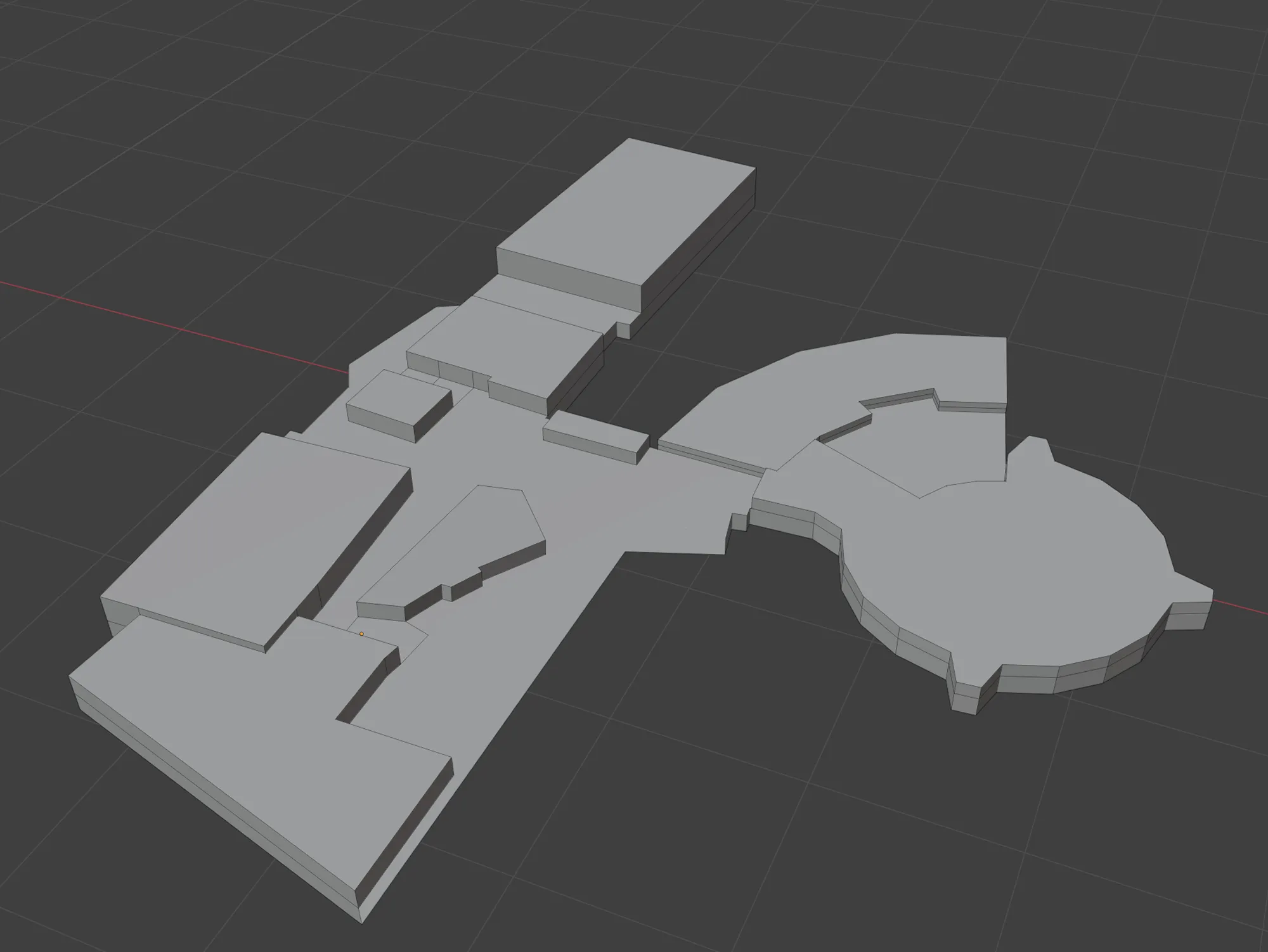
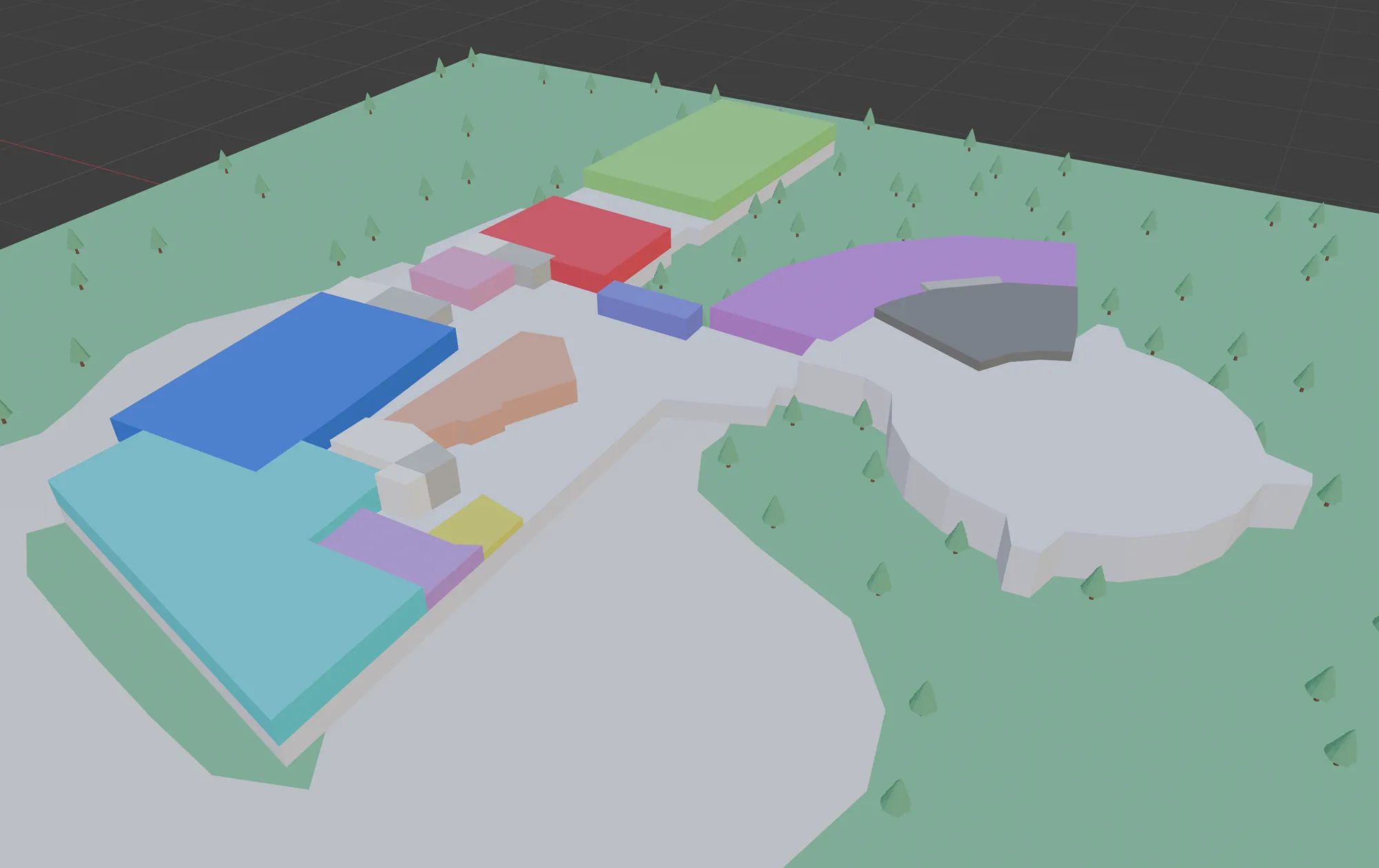
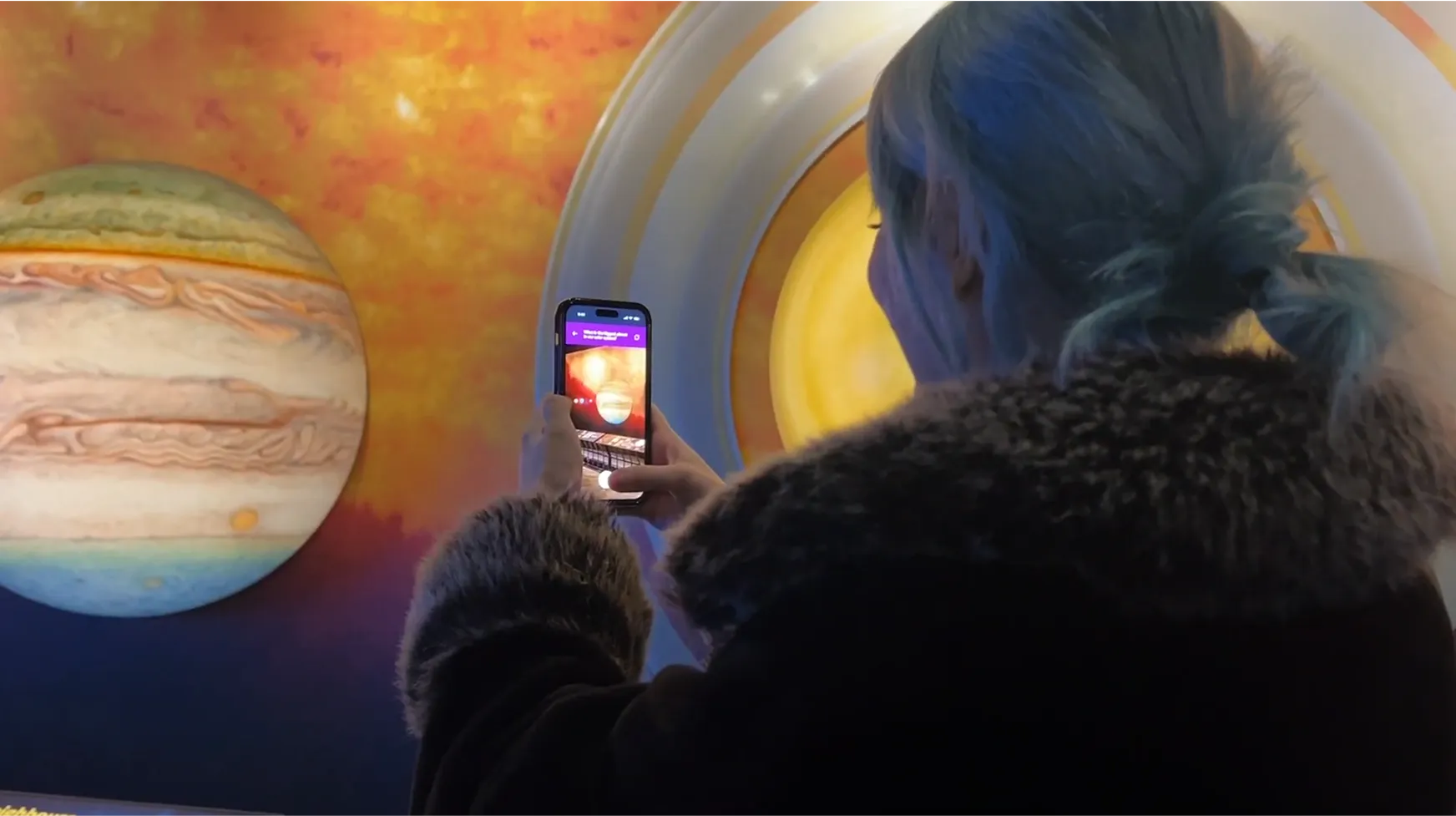
AR Integration and 3D Environment Modeling
I focused on bringing the AR navigation feature to life using Adobe Aero to prototype object scanning and directional guidance. I modelled the science centre in 3D to support the app’s interactive map and spatial features.
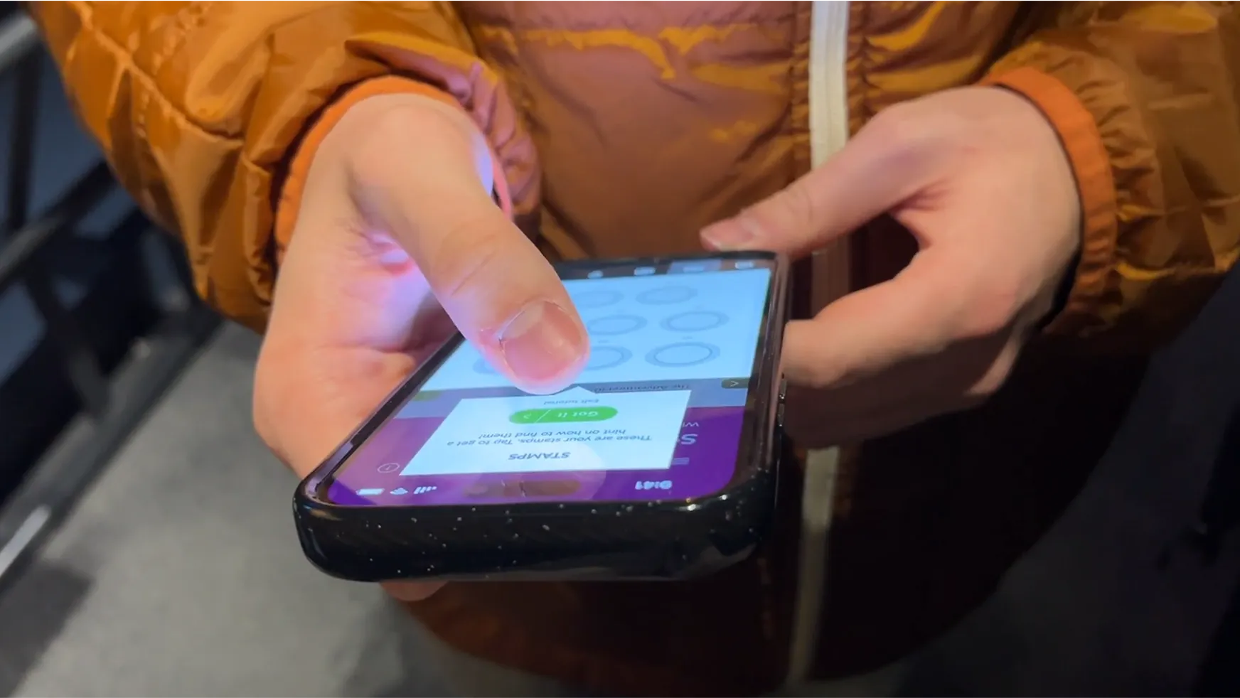
We conducted both pilot and on-site user testing to evaluate our prototype. Initial tests with friends and family helped us refine our design and interview process. At the same time, on-site testing at Telus World of Science with real users provided valuable insights into how the app performed in its intended environment.
Before:
Users had to use their cameras to scan exhibits to answer stamp book questions. However, it also created a barrier for those with camera issues or visual accessibility needs, which may cause a missed interaction with the user.
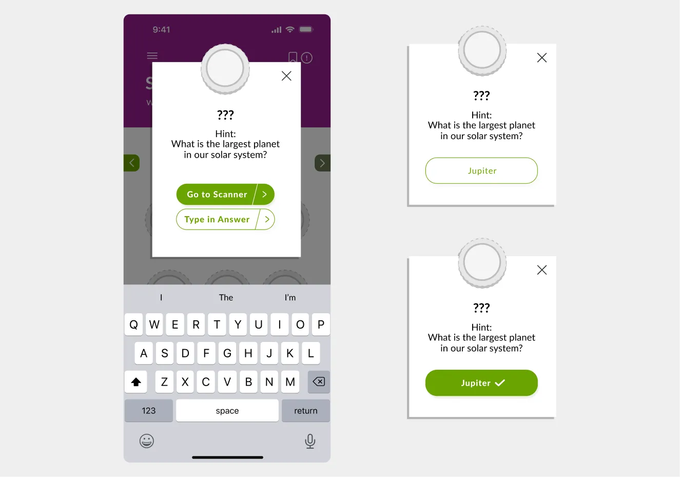
After:
To improve accessibility, we added a "Type in Answer" option directly below the scanner interface. This change provides a reliable alternative for users experiencing technical problems or physical limitations.
Before:
Before our usability test, we didn't account for users with mobility aids like wheelchairs, strollers, or individuals with low vision or sensory sensitivity. Our current map makes it difficult for the mentioned users to use our navigation features. This created friction in how they moved through the space.
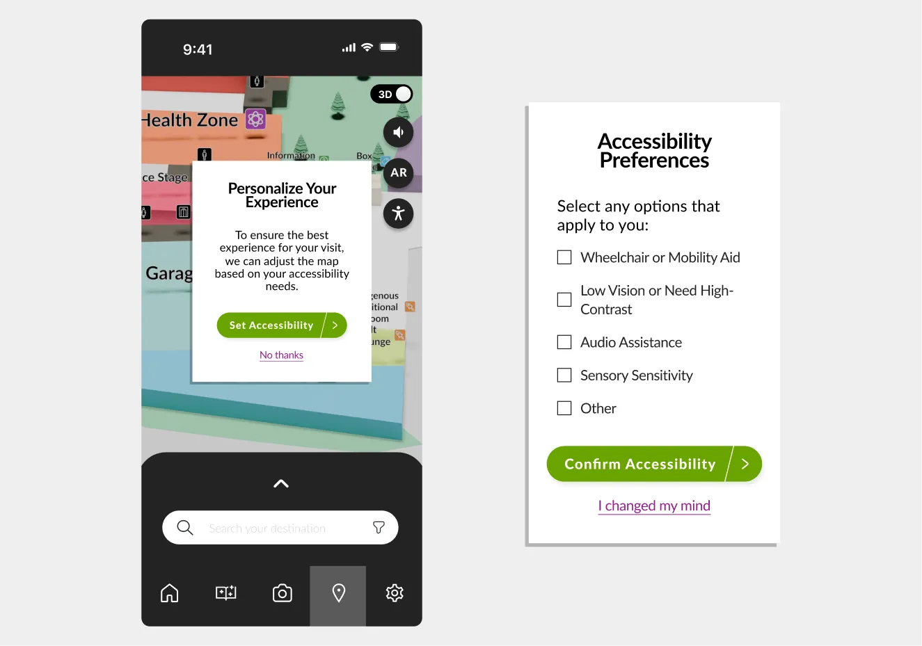
After:
To address this gap, we introduced an accessibility menu where users can personalize their experience by selecting from several options to tailor the map visuals and routes. This helps meet individual needs, improving usability and inclusion from the start of their visit.
Figma design preview
This project highlighted the value of research-driven design when creating inclusive, interactive experiences for public learning spaces like the Telus World of Science. By addressing real visitor challenges through user testing and iteration, we created a solution that makes navigation and exploration more engaging and accessible for all ages.
Designing for exploration and inclusion
We focused on simplifying complex content, improving visual clarity, and integrating gamified learning to make the experience fun and intuitive.
Initial and user research shaped every design decision
On-site testing, interviews, and pilot studies revealed navigation pain points and engagement gaps, helping us design intuitive and purposeful features.
Designing and wireframing for AR required new thinking
Integrating AR into our prototype forced us to think differently than designing for websites and apps. We had to prototype with both screen-based and real-world movement in mind to ensure AR felt intuitive.

Timeline: Jan 2025 – Apr 2025
A redesign of Excel Society’s website focused on improving usability, accessibility, and improved staff content management.
Timeline: Jan 2025 – Apr 2025
A VR tool designed to help urban planners and analysts explore geospatial data layers in 3D using the Meta Quest headset.