Figma Design
Figma design preview

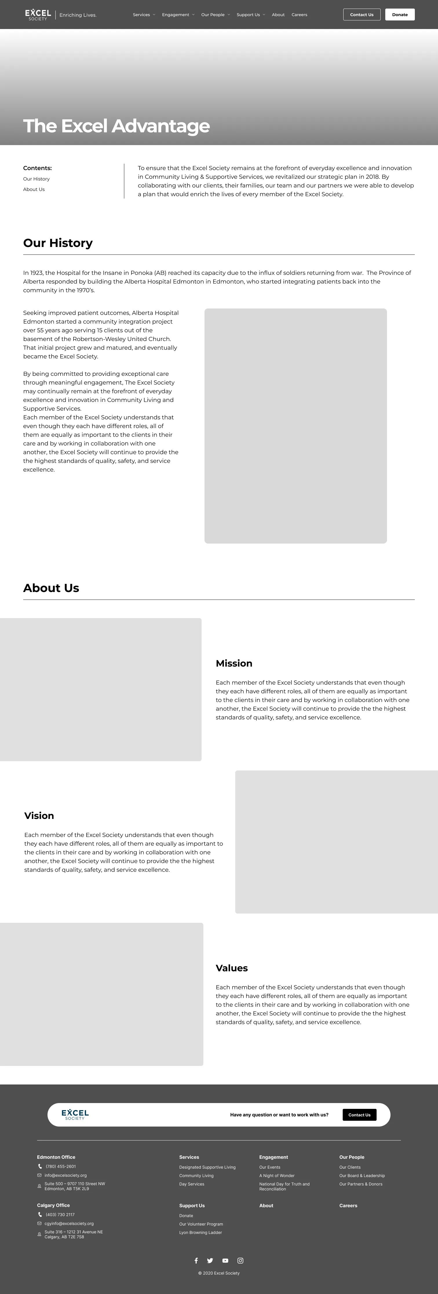
In collaboration with Excel Society and the work-integrated learning platform Ripen, we built a responsive website in Webflow that enables staff to manage content easily and helps users find services, events, and other essential information through accessible and well-organized design.
As a web developer, I collaborated with three other designer on UX research, wireframing and design. I also played a major role in Webflow development, including implementing CMS structures, building responsive layouts, and implementing JavaScript and third-party tools.
A website often serves as the first point of contact for organizations that rely on public support and community engagement. It's not just a source of information, as it's where people decide whether to get involved, seek services, or offer support. The website's various needs mean accommodating a wide range of users; however, each group brings different goals and digital expectations. The challenge lies in designing an experience that communicates and adapts to varied needs.
Dense, Unscannable Content Layout
The large blocks of text can potentially overwhelm the user and a lack of clear pathways to donate, volunteer, or participate results in low interaction rates and missed opportunities.
Unclear Communication of Mission and Services
The website does not clearly explain who Excel Society is or what they do. This lack of clarity limits user engagement and reduces understanding of their services.
Outdated System with Limited Update Flexibility
The site is built on a system that requires a developer to update content. This prevents staff from easily posting new information about events or services.
Working with my team together, we completely redesigned the website using a modern platform to address usability and maintenance challenges. Essential improvements included:
Intuitive Information Architecture
Navigation was restructured, using user-centred categories and moving pages into their respective sections.
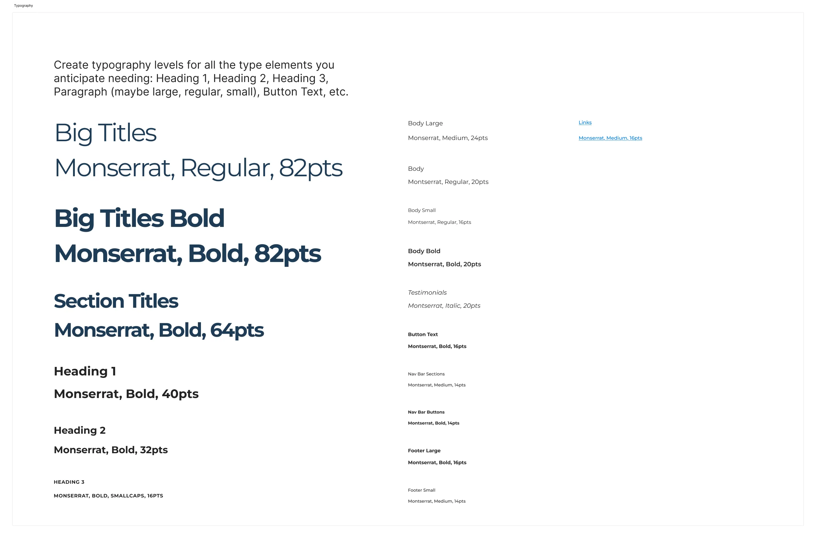
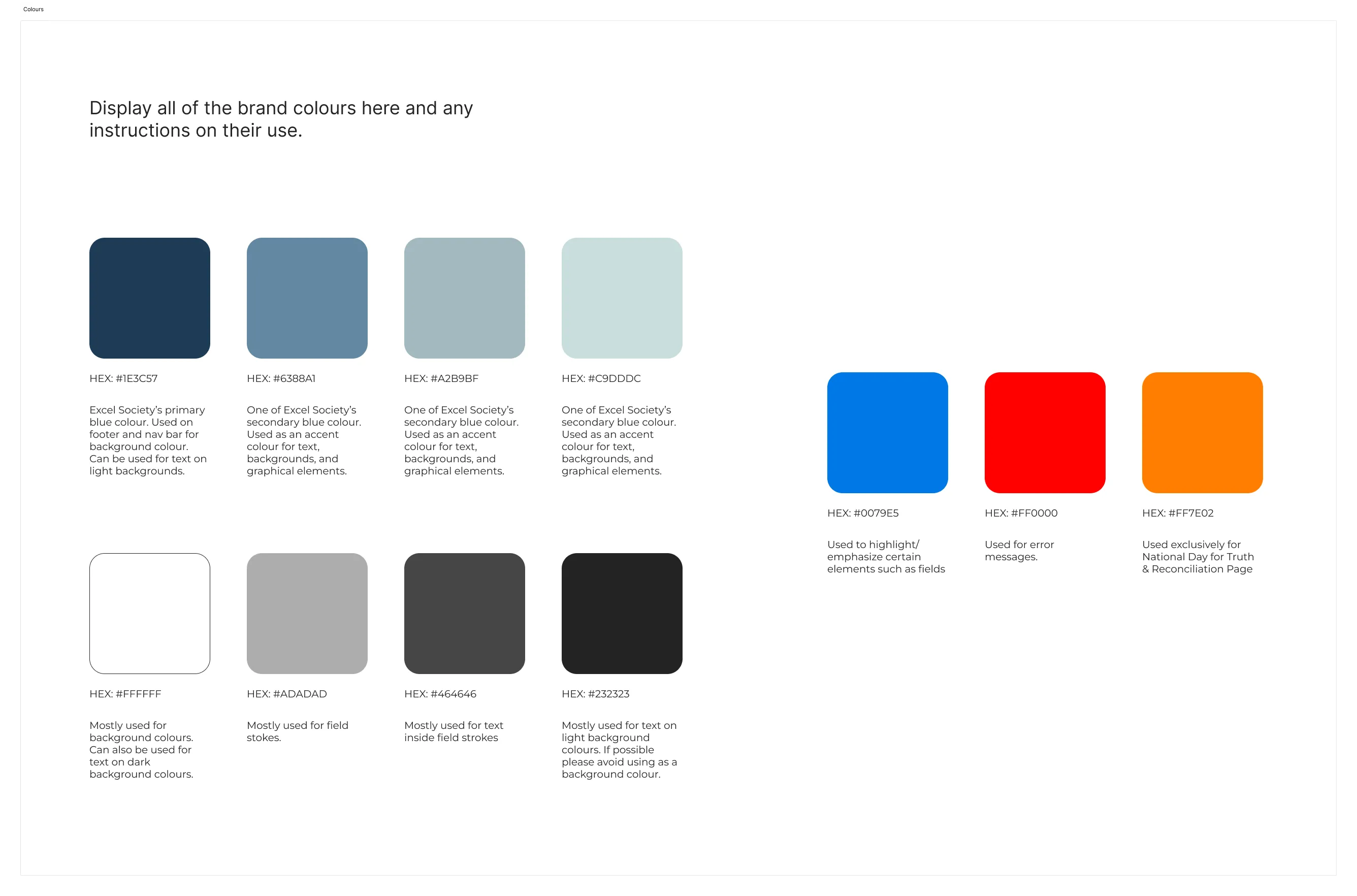
Modern Visual Design and Layout
The new design emphasized accessibility and clarity, with streamlined content, strong visual hierarchy, and high-visibility calls to action.
Client-Side Content Management
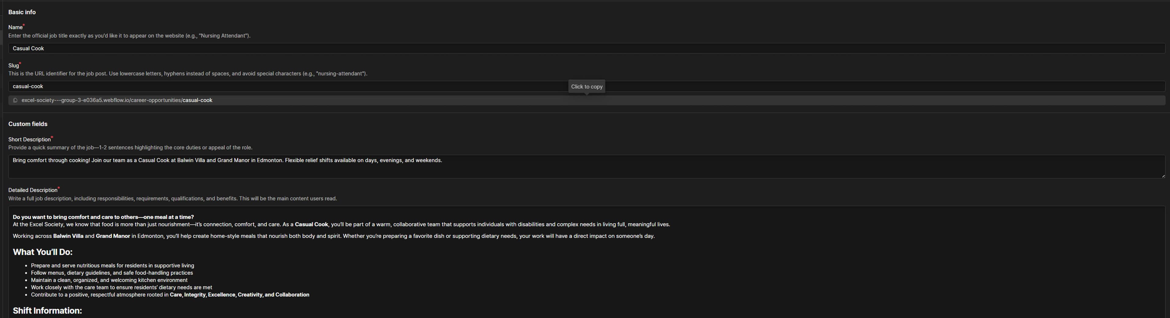
Webflow's content management system was implemented to allow staff to update events, news, and program details directly through a user-friendly dashboard, reducing reliance on developers.
Improved Engagement and Conversion Paths
A dedicated events page with filtering options and clearly placed volunteer and contact links were introduced to make participation and support more visible.
Through the initial process of research, we learned that the original Excel Society website presented major usability for its primary audiences, including supporters, clients, and volunteers and maintenance issues for their staff. We conducted a client interview, a card-sorting exercise, and a comprehensive content audit to uncover these issues.
"As a volunteer, I want to quickly find relevant information about services and events so that I can stay engaged and support the organization."
During this phase, I worked with my team to reimagine Excel Society's web experience, structure and design based on our findings and strategic insights. I contributed to the following with the help of my team:
Reorganized Content for Clarity and Navigation
We restructured the sitemap to reduce redundancy and grouped related content to help users find essential information more quickly.
Created a Cohesive, User-Friendly Interface
Drawing from our prototyping and feedback, we developed a clean and approachable design system aligned with Excel Society's mission and audience.
Improve the Accessibility and Ease of Maintenance
We designed the site to be responsive, accessible, and easy for staff to update, ensuring long-term usability without requiring technical expertise.
After completing our initial design before implementation, we presented to the client for feedback to gauge usability as well to see if it aligned with our client's goal. While we did not conduct formal user testing sessions, we shared our design with peers in our class to gather informal impressions and suggestions.
Some of the feedback highlighted that dense sections of text felt overwhelming and did not encourage users to read beyond the first paragraph. To improve this, we initially introduced a toggle button that allowed users to choose how much content they wanted to view by showing or hiding sections.
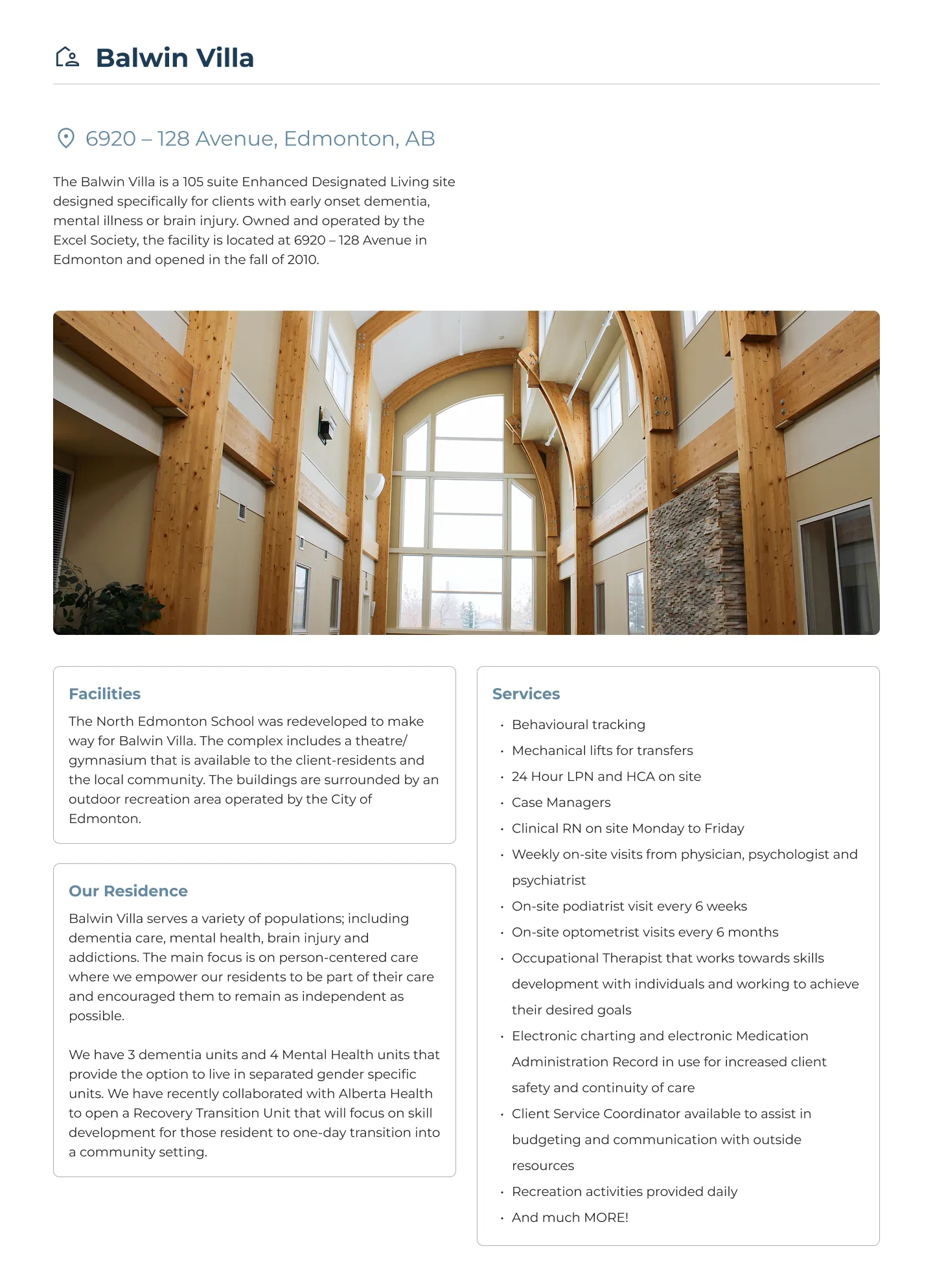
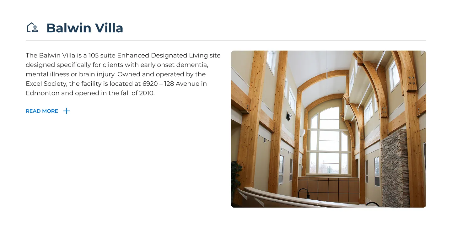
However, we noticed that this approach sometimes left pages looking empty, and there was also a concern that users might miss the toggle button entirely, leading to important content being overlooked. To address the issue, we reorganized the content into boxes and add more icons, white space, and visual hierarchies, effectively breaking up large text blocks into sections that are easier to scan and comprehend.
To bring our redesigned concept to life, we followed a structured development process using the MAST framework to simplify building grids and encourage creating and using reusable classes. While the entire team collaborated on structuring and styling pages, I primarily handled advanced interactions, JavaScript functionality, and managing structured content systems.
Content Architecture Optimization
We redefined how content was organized and connected across the site, using CMS collections for easy updates and ensuring scalability, consistency, and logical relationships between services, events, and news.
Component-Based Page Templates
We created reusable components to maintain visual consistency and streamline future updates across the site.
Responsive Design System
Every page was developed to be fully responsive across desktop, tablet, and mobile, ensuring accessibility and usability for a broad audience of guardians, donors, and clients.
Webflow Limitations for Custom Logic
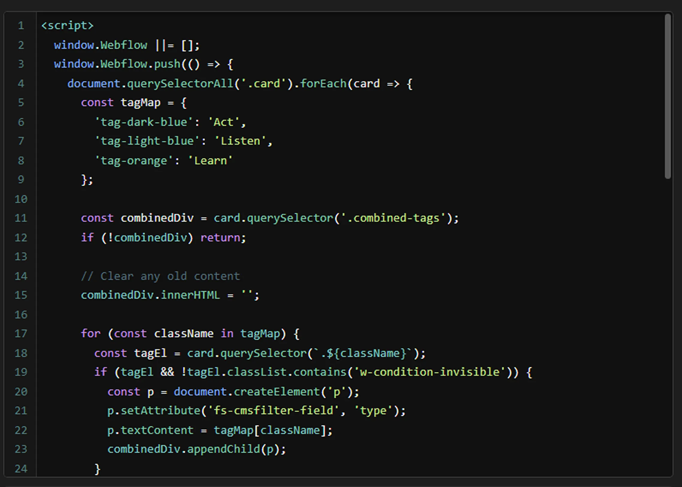
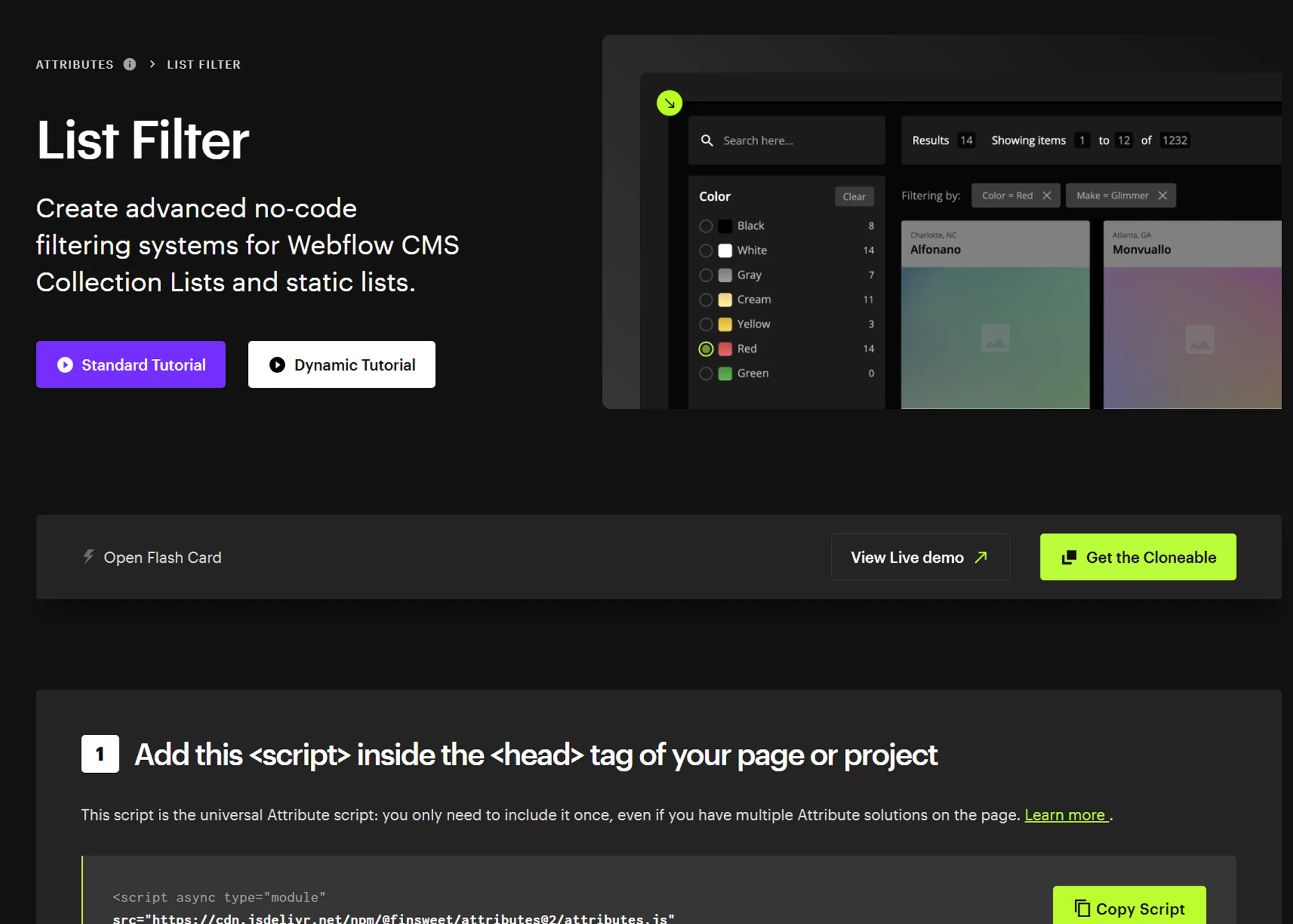
Webflow lacked built-in support for complex user interactions like dynamic content filtering with their databases. Solution: I helped implement conditional logic through structured CMS collections and integrated third-party tools like Finsweet to enable advanced filtering and interactivity.
Maintaining Accessibility Compliance
Webflow's visual editor required extra care to uphold accessibility standards, such as semantic HTML and alt text on images. Solution: We performed manual audits during development and used tools like Webflow's audit panel to meet WCAG compliance.
Content Migration and Cleanup
Many original pages had inconsistent formatting and excessive text, making direct migration inefficient. Solution: We rewrote and restructured some of the content during implementation to fit the new visual hierarchy and break dense blocks into skimmable, sectioned layouts.
Figma design preview
This project reinforced the importance of thoughtful content architecture and inclusive design, especially for nonprofits serving diverse users like supporters, clients, and volunteers. We delivered a welcoming and manageable site by focusing on accessibility with clear user pathways.
Client collaboration anchored every design choice
Interviews in both the early and middle phases helped us stay aligned with Excel Society's vision and build a site that truly supports their goals which allows for connection, clarity, and ease of use.
Balancing clarity with complexity was key
Many pages required presenting dense information, so we tried different layout strategies like visual hierarchy, sectioning, and skimmable formatting to keep content digestible without oversimplifying.
Starting from Problem Discovery to Development
From identifying usability issues through research to restructuring the content and implementing a maintainable site, our team worked iteratively to ensure every phase was built toward a solution that met user and client needs.

Timeline: Sept 2024 – Dec 2024
A mobile AR app created to enhance navigation, accessibility, and engagement for visitors at Telus World of Science Edmonton.
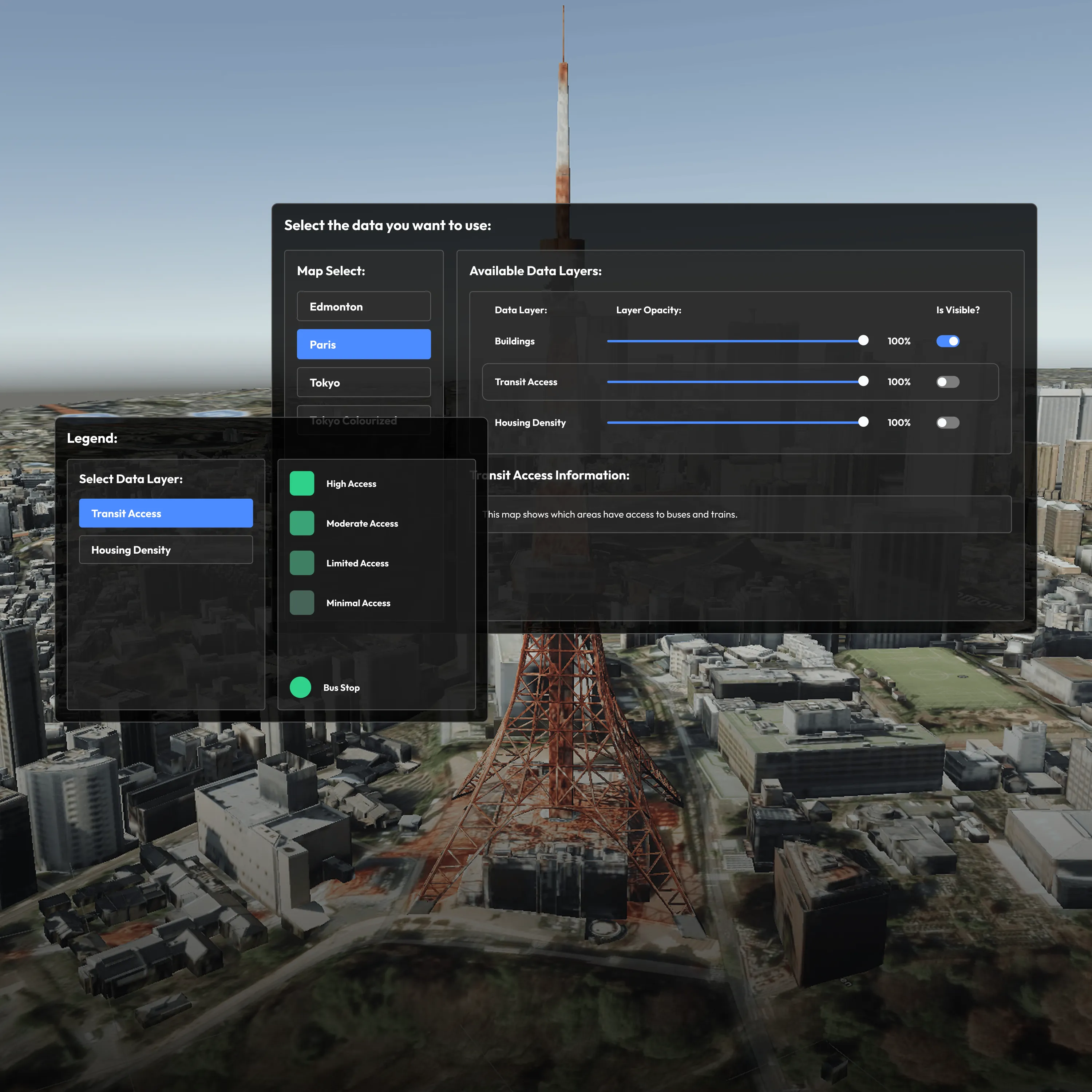
Timeline: Jan 2025 – Apr 2025
A VR tool designed to help urban planners and analysts explore geospatial data layers in 3D using the Meta Quest headset.